Visualizing Indego bike share usage patterns in Philadelphia (Part 2)
A couple months ago, I made an initial foray into understanding the usage patterns of Indego, Philadelphia's new bike share system. This month, I thought it'd be a fun exercise to revisit that data set to see if I could visualize the usage patterns a little better.
From my previous attempt, we already know that there are clear cyclical usage patterns for many of the Indego stations: Stations in residential areas tend to empty out in the mornings and refill in the evenings, whereas stations in the business sectors do the opposite. In addition to that information, I also wanted to communicate the health of the bike stations, i.e., how often the stations are full or empty of bikes.
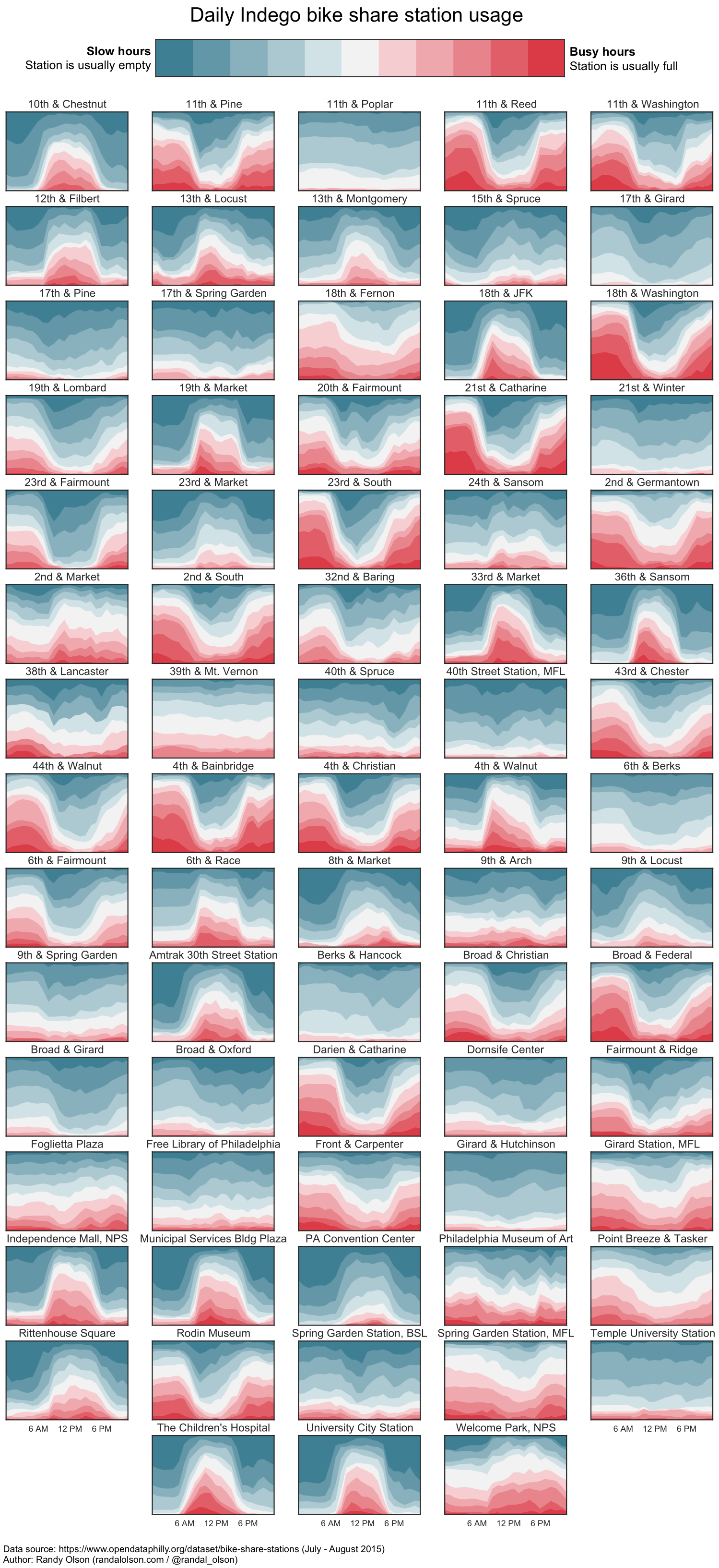
Below is my attempt at combining both pieces of information into a single graph. Use this visualization to plan your commutes and avoid the busy hours for your local bike stations.
Each sub-graph corresponds to an active Indego station, showing the average performance from morning (left) through the evening (right). The y-axis represents the percentage of time the station is full, empty, or somewhere in between during the corresponding hour. Darker reds represent fuller stations, whereas darker blues represent emptier stations.
To give a specific example, let's zoom in on the 21st & Catharine station.
The 21st & Catharine station is clearly a commuter station: The dominant red shades in the mornings and evenings show that it tends to fill up with bikes during non-work hours, while the creeping blue shades during the workday show the station emptying out as people ride bikes to work.
In contrast, the station at 17th & Girard sees much less action: The station sits more-empty-than-full most of the time, with only a minor outflux of bikes during work hours.
The nice part about these visualizations is that they show how reliably available each bike station is throughout the day: Stations like 17th & Girard are practically always ready to receive or provide a bike at any point in the day, whereas stations like 21st & Catharine are regularly bouncing between full and empty on the weekdays.
So, what do you think? Does this visualization method show the station usage trends better than before? How do you think it can be improved from here?


