Visualizing Indego bike share usage patterns in Philadelphia
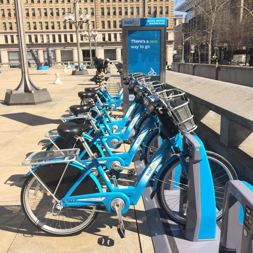
One of the many things that I love about my new home town of Philadelphia is that the government openly shares curated data sets covering most of the governmental functions. Since I recently joined Philadelphia's Indego bike share program, I decided to start working with their bike usage data set to see what useful tools I could build.
If you've ever used a bike share before, you know that one of the biggest fears is coming up to an empty bike share station when you need a bike. (Or similarly, coming up to a full station when you need to drop a bike off.) To help abate those fears, I've started monitoring the Indego bike usage API to see if I could model and predict when the bike share stations are most likely going to be empty or full. This tool is useful in two ways:
- It helps the Indego users by keeping them aware of the bad times to use certain bike share stations.
- It helps the Indego bike share service by predicting when a particular bike share station will require service (e.g., driving a truck out to pick up or drop off a large batch of bikes).
Undoubtedly Indego's data science team is already performing some flavor of this model-and-predict scheme, but I thought it'd be fun to publicly tackle this problem and see how far I could get. For this post, I'll focus on visualizing patterns in the data, and will take a stab at prediction in a future post.
Daily usage patterns
One of the first steps toward building a model that can make any sort of useful prediction is to look at the existing patterns in the data. How are Philadelphians making use of the Indego bike share program? What does a typical day look like for the Indego bike share program?
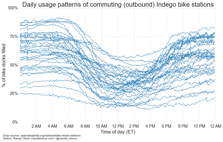
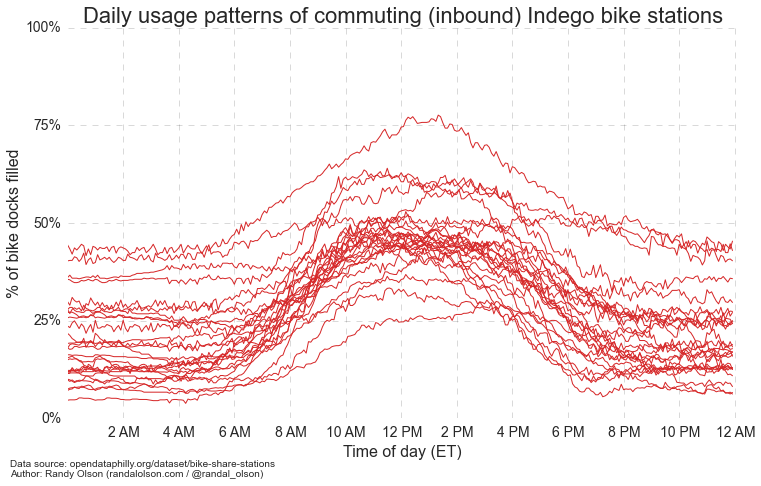
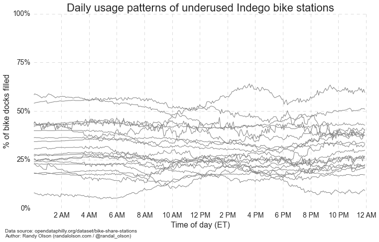
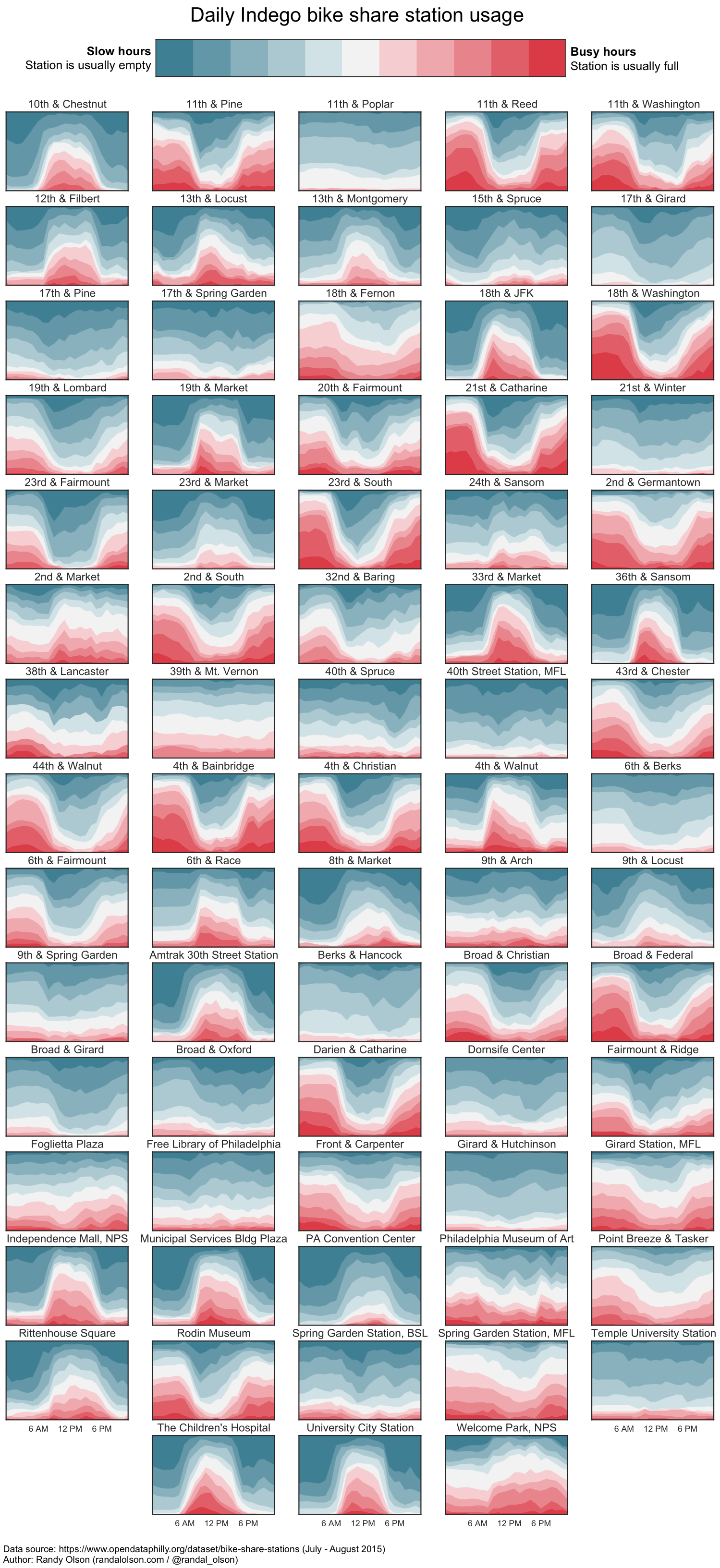
To get at those questions, I've been gathering the current status of each bike share station every 5 minutes since July 1, 2015. To provide some visuals of the data, I fit regressions to the usage patterns of each individual bike share station. The measure I'm using here to represent "station usage" is the percentage of a station's docks that are filled with bikes, where 100% represents a station full of bikes and 0% represents an empty station.
keywords: Indego, bike share, Philadelphia, machine learning, modeling, visualization visualization description: Randy Olson visualizes the Indego bike share usage patterns in Philadelphia to see how the locals are making use of the bike share program.I've plotted each regression below, separated into three distinct categories:
- Outbound commuting stations: Stations where people take a bike from home to ride to work or school.
- Inbound commuting stations: Stations where people take a bike from work or school to ride back home.
- Underused stations: Stations that see minimal use compared to the other stations.
As the two above plots show, many Philadelphians have adopted the Indego bike share program into their daily commute to work. Around 8 AM ET, we start to see bikes leaving several stations around town, which is followed shortly thereafter by an influx of bikes into stations at other parts of the city. Similarly around 5 PM ET, we see the reverse trend, with bikes heading back to the home stations.
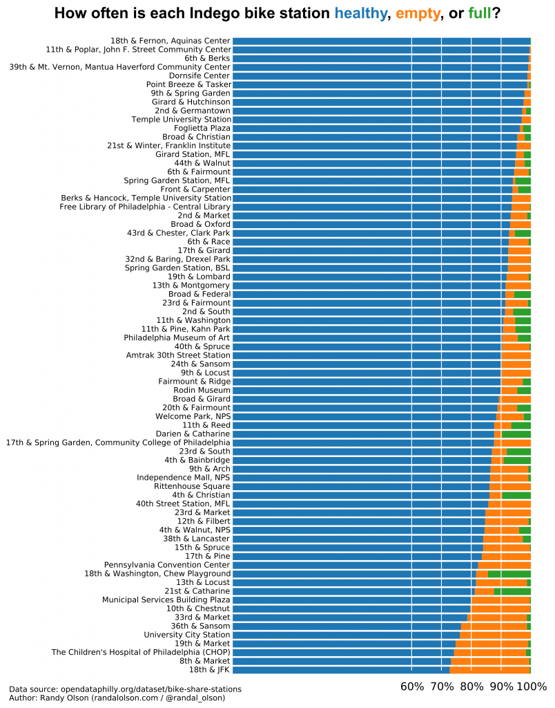
Unfortunately, several bike share stations seem to go mostly ignored. As shown in the above plot, these stations see little to no change in their usage throughout the day -- with the same bikes sitting in their docks day by day -- which perhaps means the stations need to be relocated.
Mapping the daily usage patterns
To provide a better spatial context to the above patterns, I mapped each bike share station onto an interactive map of Philadelphia and color-coded the stations by their usage pattern.
As expected, the stations that see a large influx of bikes during work hours are in the primary business districts and education centers of Philadelphia. The bike stations along Market Street, around the University of Pennsylvania and Drexel University, and even up at Temple University are all places that Indego bike sharers ride to work.
In contrast, most of the bike stations that see a decline in bikes in the morning are in residential areas further out in the city. This observation only piles on evidence that the Indego bike share program is being used for daily commutes to work and school moreso than joyrides by tourists.
By this view, the Indego bike share program has been a resounding success so far. Some of the existing underused stations may require adjustment, but it's quite clear that Indego is here to stay.
Weekly usage patterns
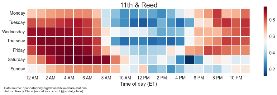
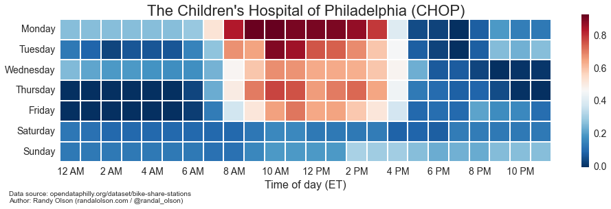
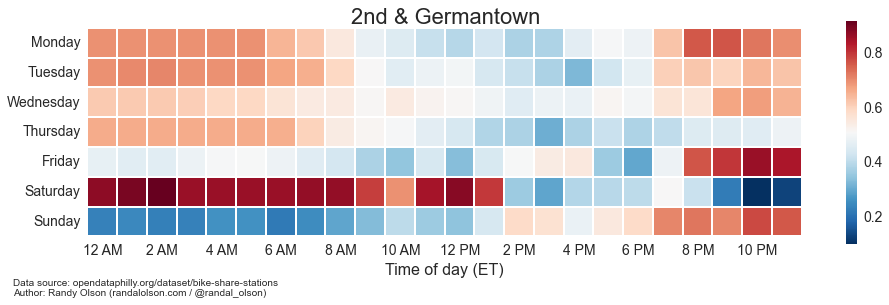
Finally, I thought it would be interesting to show the weekly usage patterns of the stations. I've selected a handful of stations below and plotted their usage patterns, where darker red means "close to full of bikes" and darker blue means "close to empty."
The stations at 11th & Reed and CHOP display the stereotypical commuting patterns that I discussed above. Interestingly, the CHOP station is one of a handful of stations that seems to be used almost exclusively for commuting, whereas most stations see some form of notable activity on the weekends.
Above, I've visualized the weekly usage patterns of the station at 2nd & Germantown to highlight the irregular usage patterns of some of the Indego bike share stations. Even though the 2nd & Germantown station is used as an outbound commuter station on the weekdays, it's also quite popular as a station to reach the bars, restaurants, and activities in Northern Liberties on Friday night.
At this point, I clearly need more data to properly model and predict the usage patterns since it's fairly clear that some bike stations are used differently at different times of the week. In the meantime...
What else would help the Indego bike share program?
I was previously thinking that we needed an Indego dock status tracker, but the most common devices are already covered: web | iOS | Android
Do you have any ideas for what tools would be useful to supplement the Indego bike share program? Feel free to add your suggestions here in the comments.

Dr. Randal S. Olson
AI Researcher & Builder · Co-Founder & CTO at Goodeye Labs
I turn ambitious AI ideas into business wins, bridging the gap between technical promise and real-world impact.
