U.S. college majors: Median yearly earnings vs. gender ratio
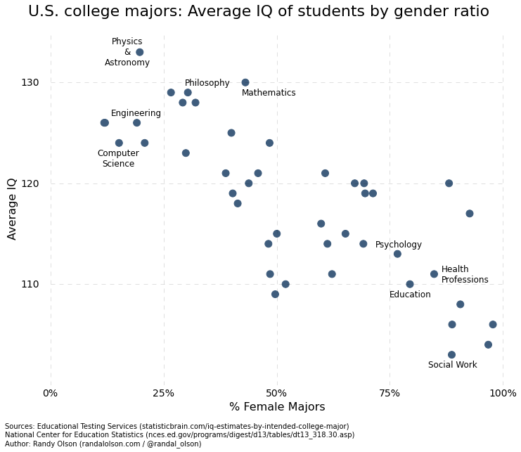
Last year, I looked at the gender ratios across college majors and discovered an interesting-yet-spurious correlation: College majors with higher male:female ratios (i.e., with more men than women) tend to have students with higher estimated IQs. After much debate, the correlation seemed to be explained by the fact that male-dominated majors tend to be more quantitative in nature, and the IQ estimation procedure relied heavily on students' quantitative SAT score. Thus, we were only observing a gender preference for quantitative vs. non-quantitative majors.
Recently, I ran across an interesting FiveThirtyEight article that analyzed the estimated median earnings for recent college graduates broken down by major. The data that they used from the American Community Survey was publicly available on their GitHub, so I decided to take a closer look at the correlation between estimated median earnings and the gender ratio for each majora.
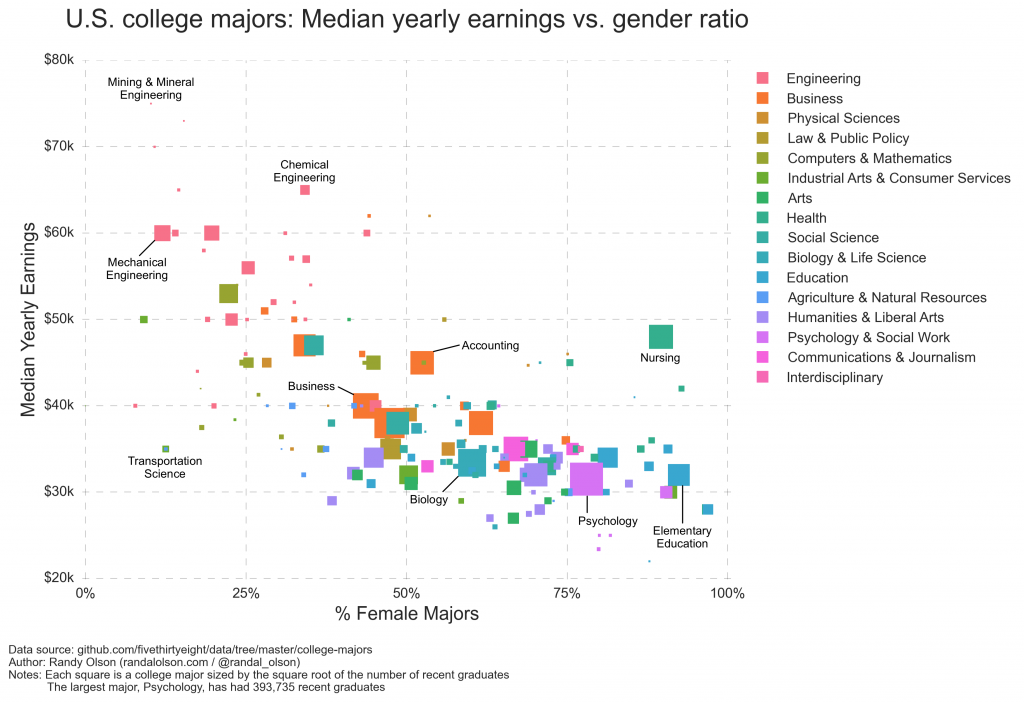
Below, each square is a college majorb scaled by the number of recent college graduatesc. The squares are colored by the general category of each major, and I annotated a handful of the most popular majors. If you'd like to look up specific majors, use FiveThirtyEight's lookup tables.
The trend that's immediately apparent from this chart is that female-dominated majors make less on average than male-dominated majors. Some interesting exceptions to the trend are Nursing (90% women; $48k median earnings) and Transportation Science (12% women; $35k median earnings), where Nursing especially stands out as a relatively lucrative major despite being primarily women.
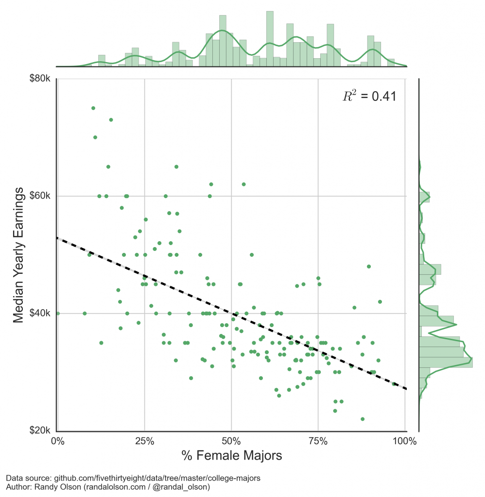
Despite the outliers, we're still left to wonder: Is it really true that women earn less than men -- even for college graduates? I decided to investigate this issue a little further. Of course, the first step is to make sure that our eyes aren't fooling us, so I fit a linear regression onto the data and weighted the majors by their number of recent graduates.
Sure enough, there's a clear and significant negative correlation between a college major's median year earnings and gender ratio. Let's try to find out why.
Why do female-dominated majors earn less?
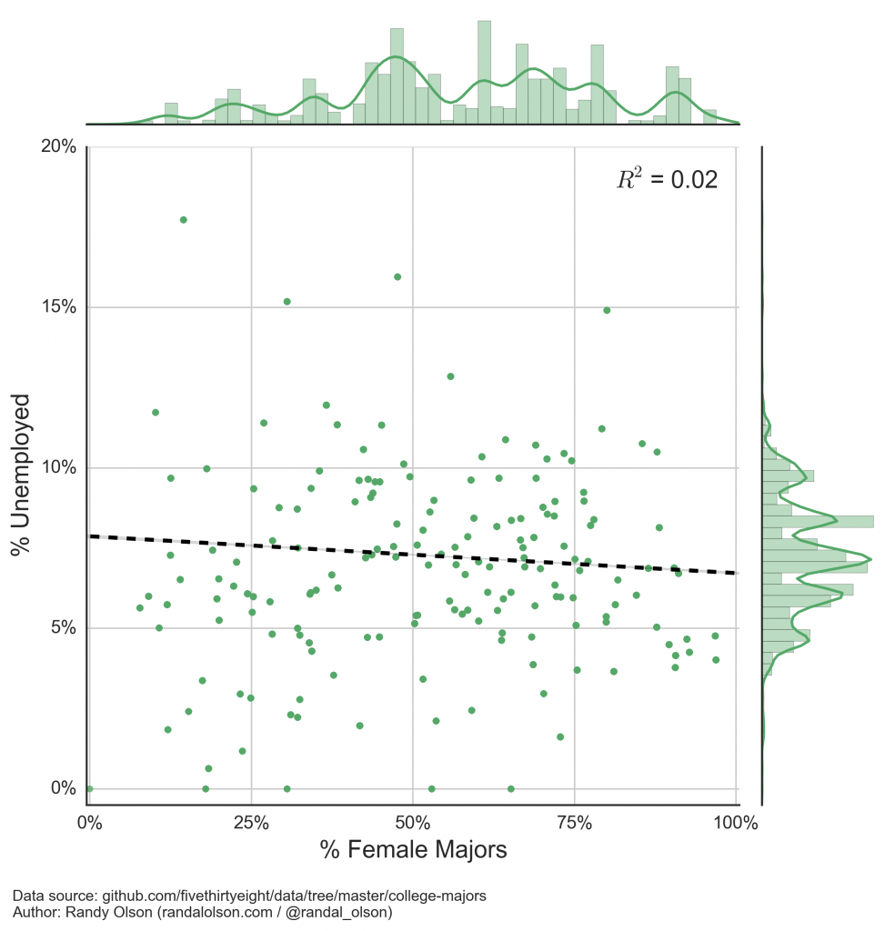
If you look through the list of female-dominated majors, you'll notice that many of them can be quite difficult to find a job with because they're so competitive: There are far more graduates than jobs in many of the fields. Could female-dominated majors be earning less because they couldn't find a job after college? The unemployment rate for each major was included in the data set, so let's take a look at that correlation below.
For the most part, this idea seems to be busted: There is no significant correlation between the gender ratios and unemployment rates of college majors, and most majors are sitting around the national unemployment rate of 5.5%.
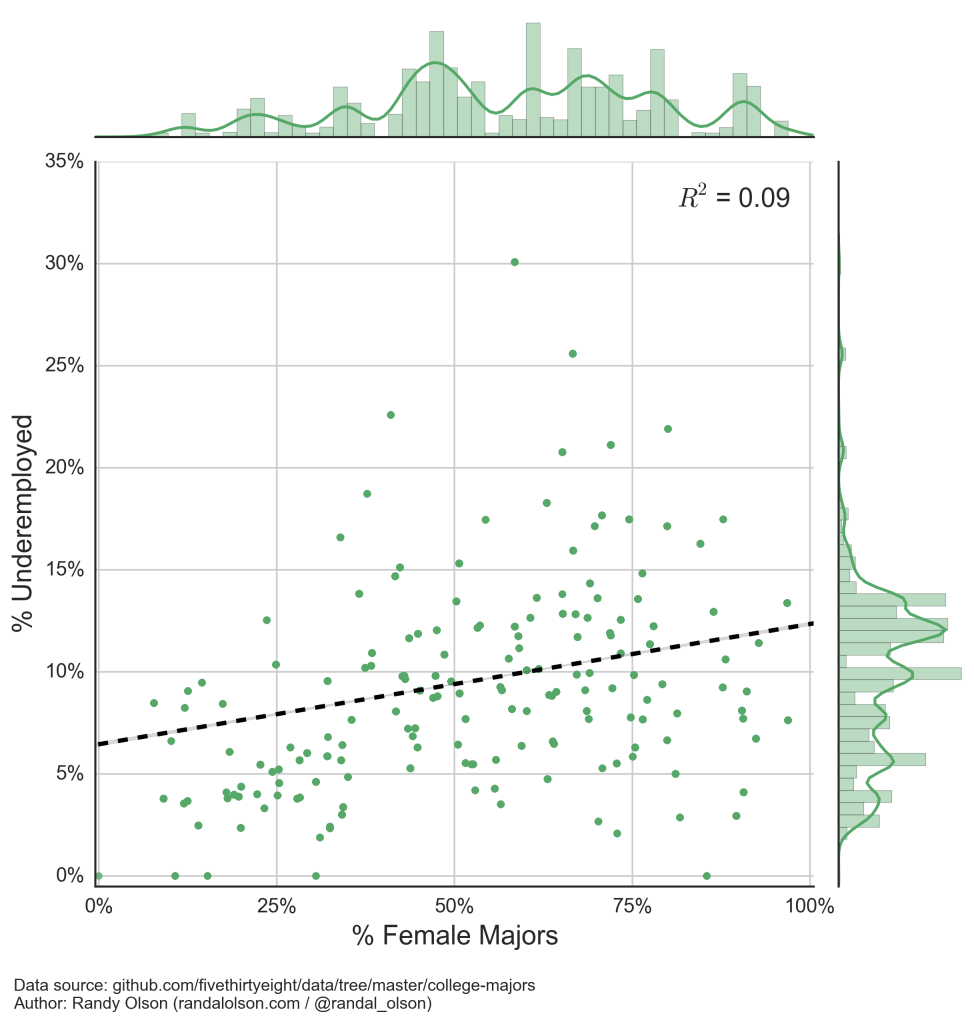
What about underemployment? In his FiveThirtyEight article, Ben Casselman wrote that drama majors (which tend to be female more often than male) are more likely to end up waiting tables than using their degree. Underemployment rate was also available for each major, so let's take a look.
Yet again, our idea has been busted: There is only a weak correlation between the gender ratios and underemployment rates of college majors, so the typical narrative of useless college degrees doesn't seem to explain why male-dominated majors earn more than female-dominated ones.
I was a bit lost at this point until I remembered my controversial post from last year.
Back to an old study...
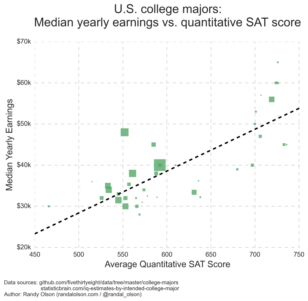
If you read my blog last year (or read the introduction to this post!), you may remember the correlation between quantitative SAT scores (and IQs) and gender ratios of college majors. What if we matched up the quantitative SAT scores -- which can be used as a proxy for how quantitatively-focused a major is -- with the median earnings for each majord?
(Again, the majors are scaled by the number of recent graduates to provide a sense of relative popularity.)
(For the stats nerds: R^2 = 0.624)
Perhaps this all makes sense now: It seems possible that male-dominated majors -- such as Engineering, Physics, and Computer Science -- earn more than female-dominated majors because male-dominated majors are often more quantitative in nature. These quantitative majors are often employed by large companies to design products, perform data analysis, manage the company, etc., and their salaries are higher to match the responsibilities of the job.
It's another question of whether businesses and governments should value the services provided by quantitative majors more than, say, Education majors, but I'll leave that discussion for another day.
Disclaimer
Of course, correlation != causation, and I'm not trying to make any causative inferences here. We would need to perform controlled experiments if we wanted to establish a causal relationship. I'm simply building a plausible narrative around these correlations in case anyone wanted to explore these correlations in more depth in the future.
Summary
- Female-dominated majors tend to earn less than male-dominated majors
- This correlation isn't explained by the employability of the majors
- It seems plausible that male-dominated majors are usually paid more because they are more quantitative in nature, which large companies tend to value highly
Alternative explanations
So, what do you think? Do you think this explanation holds, or do you think there's another explanation at work here? I'll do my best to describe plausible alternative explanations in this section.
- One of the commenters mentioned that we should view the correlation in the opposite direction: "Men are more driven by income when choosing majors than women. Women value attributes other than income more than men."
Technical notes
a There are plenty of caveats that come with this data set, and I advise reading up about them in the FiveThirtyEight article.
b I excluded Petroleum Engineering from this analysis for clarity, which is a small outlier major (only 2,339 recent graduates) with a median salary of $110k and only 12% women.
c "Recent" graduates are graduates under age 28, which is roughly within five years of graduation on a normal schedule.
d I performed this merger manually and did my best to match the majors when their name did not match exactly. Several majors were dropped since quantitative SAT scores were only available for a subset of majors. You can find that data set here.

Dr. Randal S. Olson
AI Researcher & Builder · Co-Founder & CTO at Goodeye Labs
I turn ambitious AI ideas into business wins, bridging the gap between technical promise and real-world impact.
