Major League Baseball home run leaders, 1871-2016
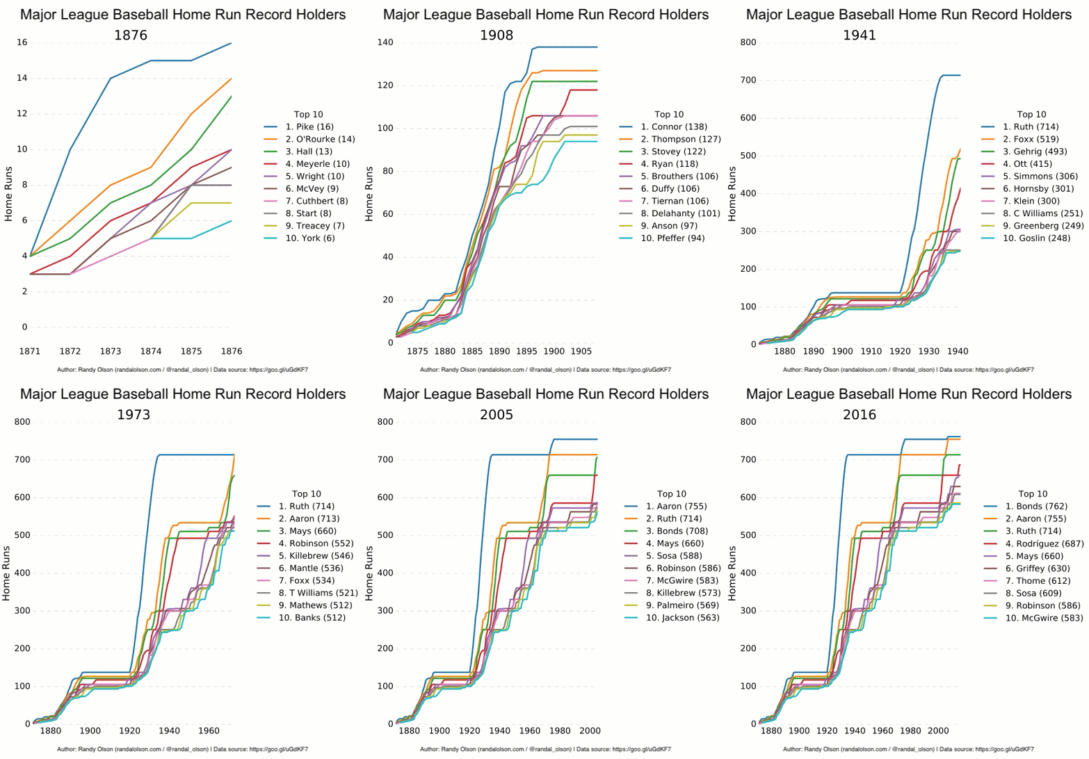
Earlier this week, a Reddit user shared a fascinating animated data visualization showing the MLB home run leaders from the past 200+ years. I found this visualization especially interesting because it was one of the few examples where I've seen an animated data visualization effectively tell a story that a static visualization couldn't tell. I've recreated the user's visualization with Python below.
We see the early battle for the home run throne in the late 1800's, then a period of stagnation in the early 1900s. As one Redditor explained:
The reason why the records remain fairly stagnant from 1903-1920 is because there was a Dead-ball era in the MLB. During the "Dead Ball Era," ballparks had ridiculously large dimensions, balls were used until they weren't useful anymore, and many pitchers "doctored" the ball by spitting on it or covering it in tobacco.
Shortly thereafter, we see why Babe Ruth was such a sensation in the 1920s, as his record skyrocketed to 714 home runs over his career. Ruth held that record until the 1970s, when Hank Aaron dethroned him and held onto the record for another 40 years. There's a lot more to discover in this animated visualization, but I'll leave that as an exercise to the reader.
The downside of this visualization
Of course, the most obvious criticism of this visualization is that the lines represent different people over time, which can be disorienting to some viewers. It's important to remember that this visualization is meant to show the evolution of home run records over time, and not necessarily the home run records of any particular individual.
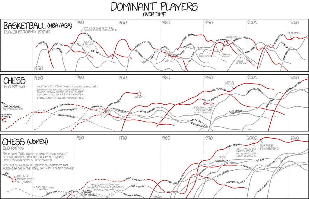
One possible way to overcome this shortcoming is to take a cue from xkcd and assign each player their own line:
However, we would likely have to limit the number of players we visualize at once, and would likely only be able to show one or two dominant players during each time period.
Furthermore, since career home run records only go up over time, we would quickly see the 400+ home run range filled with several player's records. Perhaps an xkcd-like version can be made for yearly home runs of dominant players, but I'll leave that as an exercise for the future.
How do I remake this visualization?
Below is the Python code that I used to generate the animated visualization. Once you've generated all of the individual frames, you'll have to stitch them together with a program such as ffmpeg or Camtasia.

Dr. Randal S. Olson
AI Researcher & Builder · Co-Founder & CTO at Goodeye Labs
I turn ambitious AI ideas into business wins, bridging the gap between technical promise and real-world impact.
