Teaching an AI Agent to Make Beautiful Charts
Most AI-generated charts look generic because nothing stops them from being generic. This series takes a different approach: an AI agent builds each visualization from scratch, then revises it until it passes the Tufte Test, a quality standard built on Edward Tufte's principles for clear, effective charts. The posts below track that progress, one chart at a time.
Beautiful Charts with AI
Want to test your own charts against the same quality bar?
Try the Tufte Test on your own chart, or get future updates on AI evaluation and chart quality from Goodeye Labs.
Latest
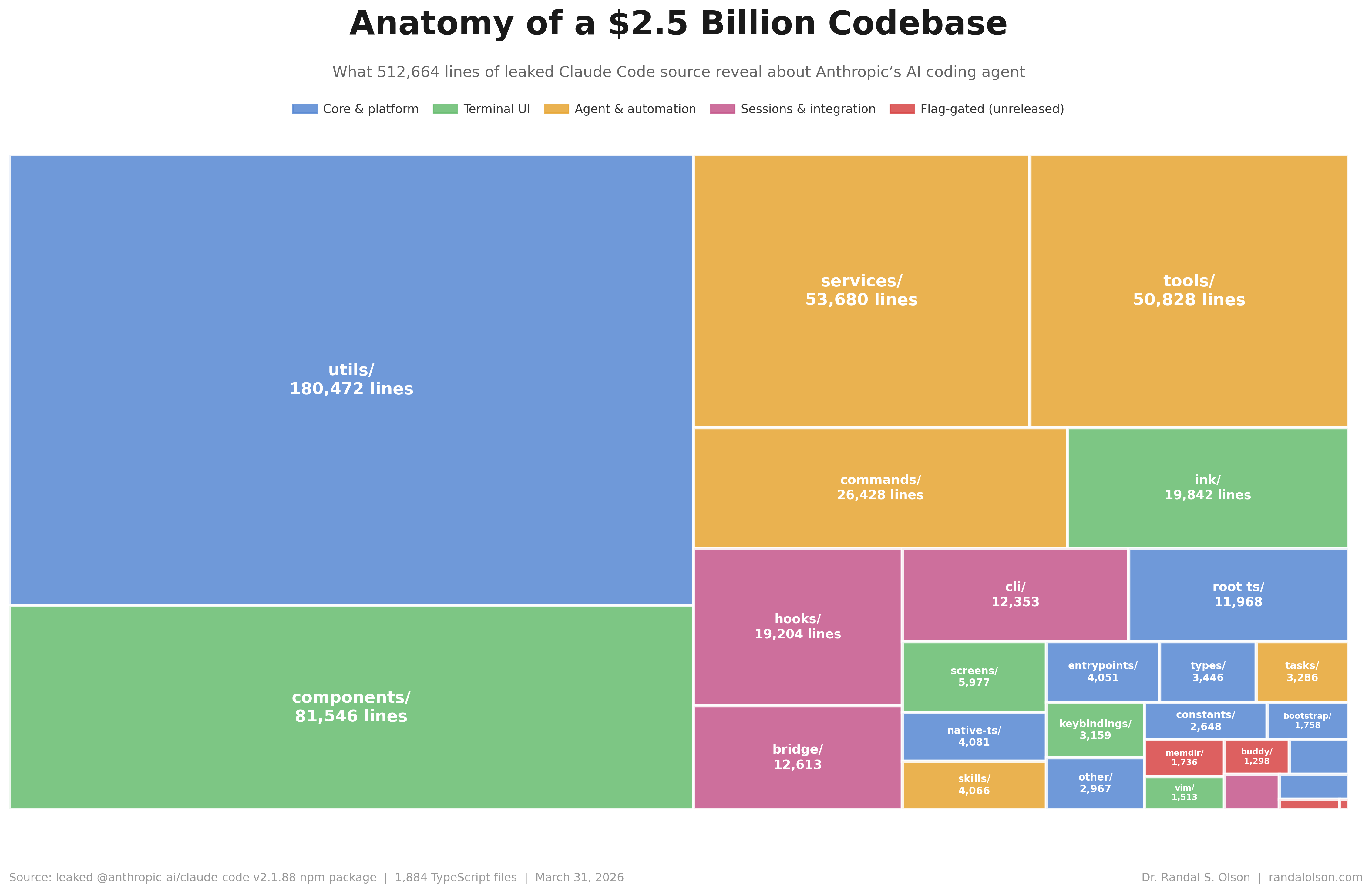
The Claude Code leak in four charts: half a million lines, three accidents, forty tools
Community mirrors of the @anthropic-ai/claude-code npm package spilled roughly 513k lines of TypeScript. Four charts break down the directory tree, the accident timeline, a hidden buddy simulator, and the forty tool modules.
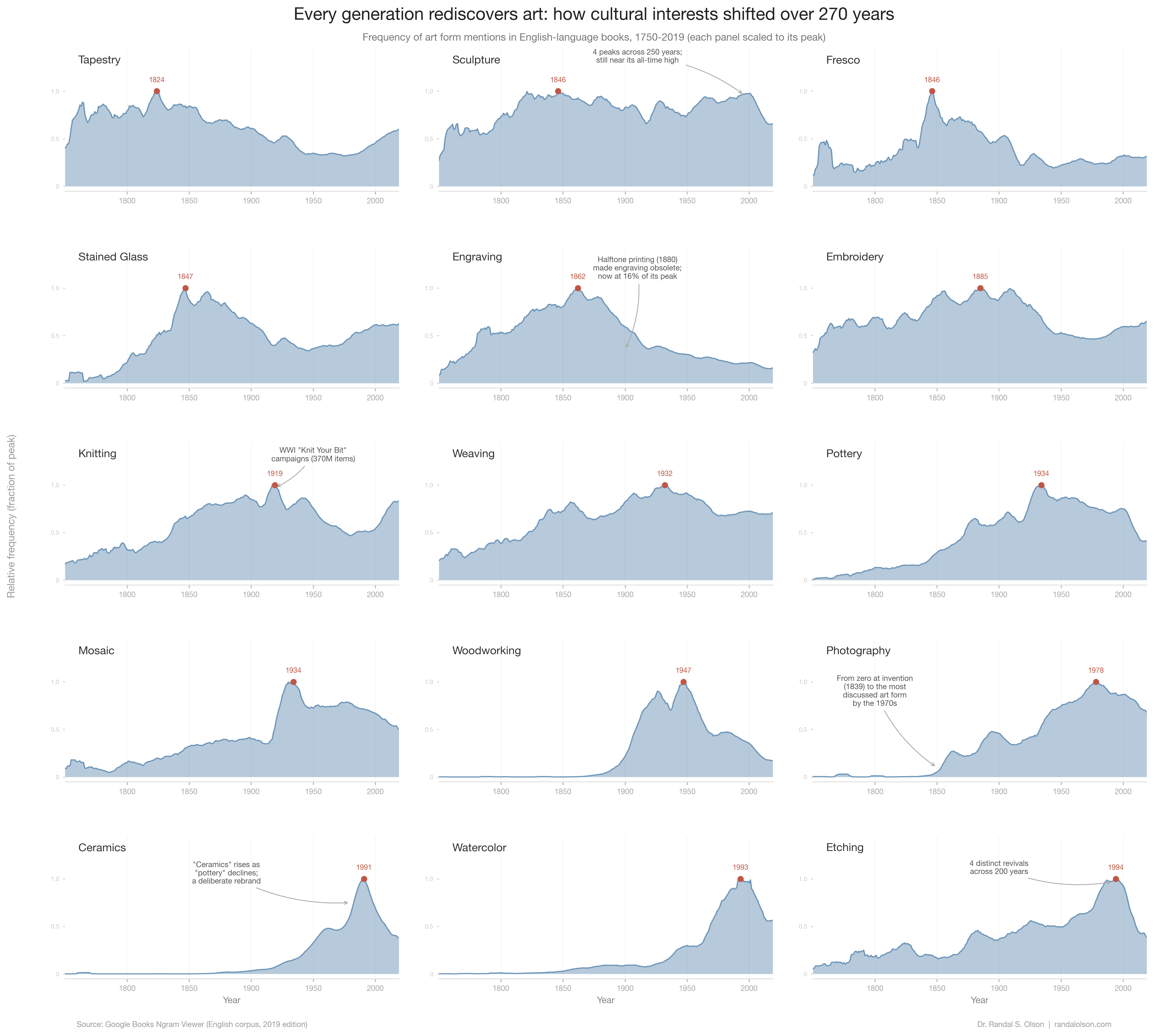
Every generation rediscovers art: 270 years of cultural interests in one chart
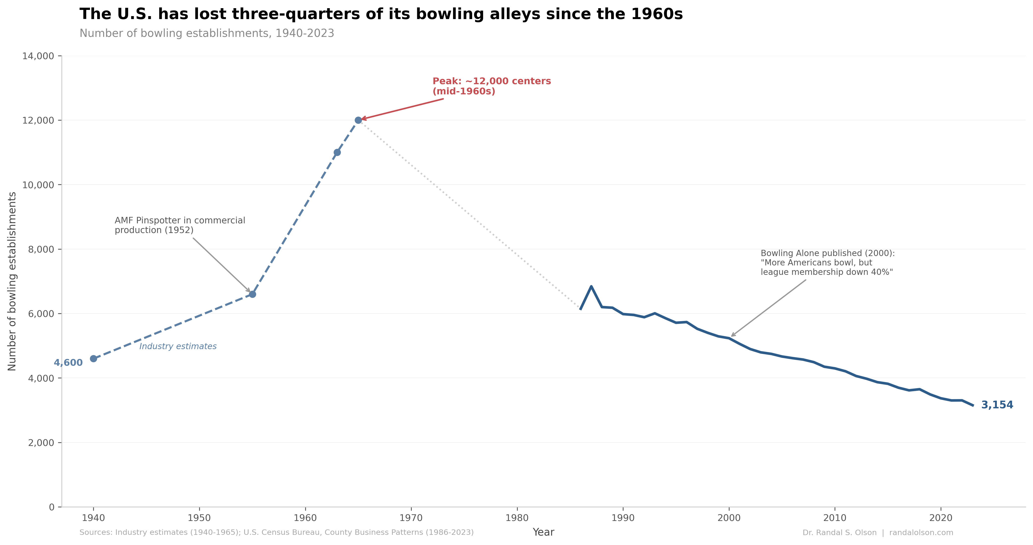
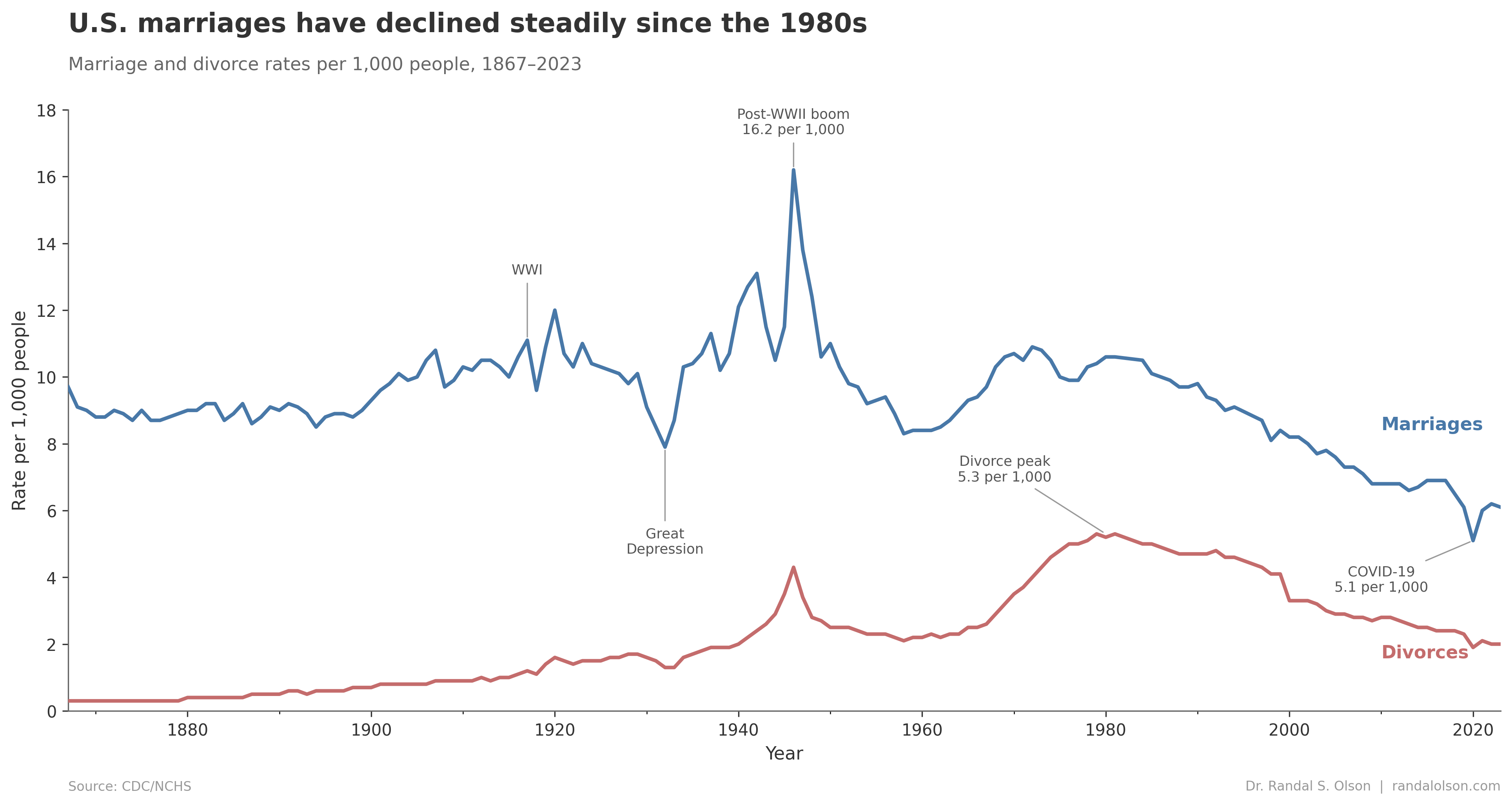
The rise and fall of bowling in the United States
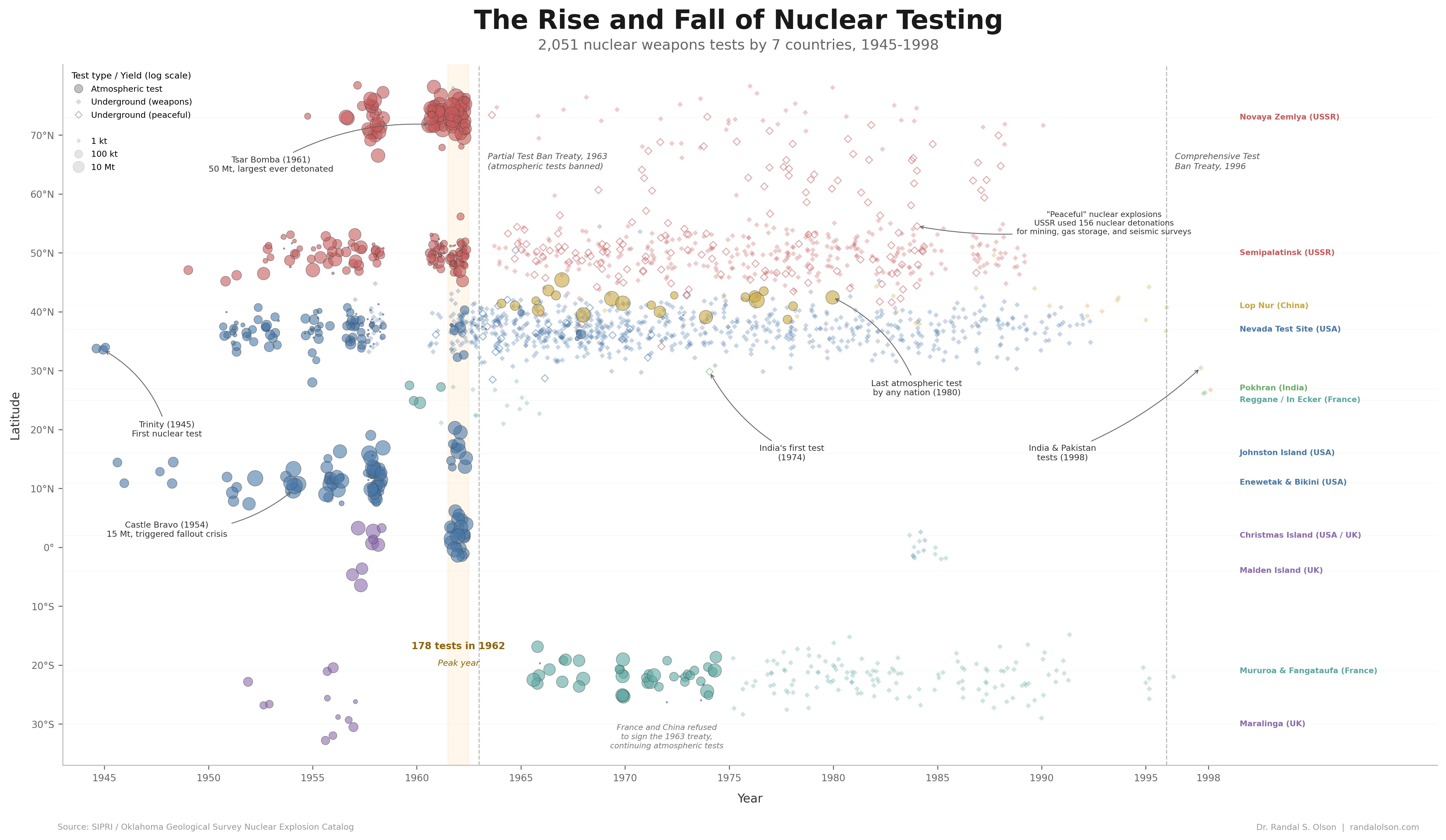
The rise and fall of nuclear weapons testing
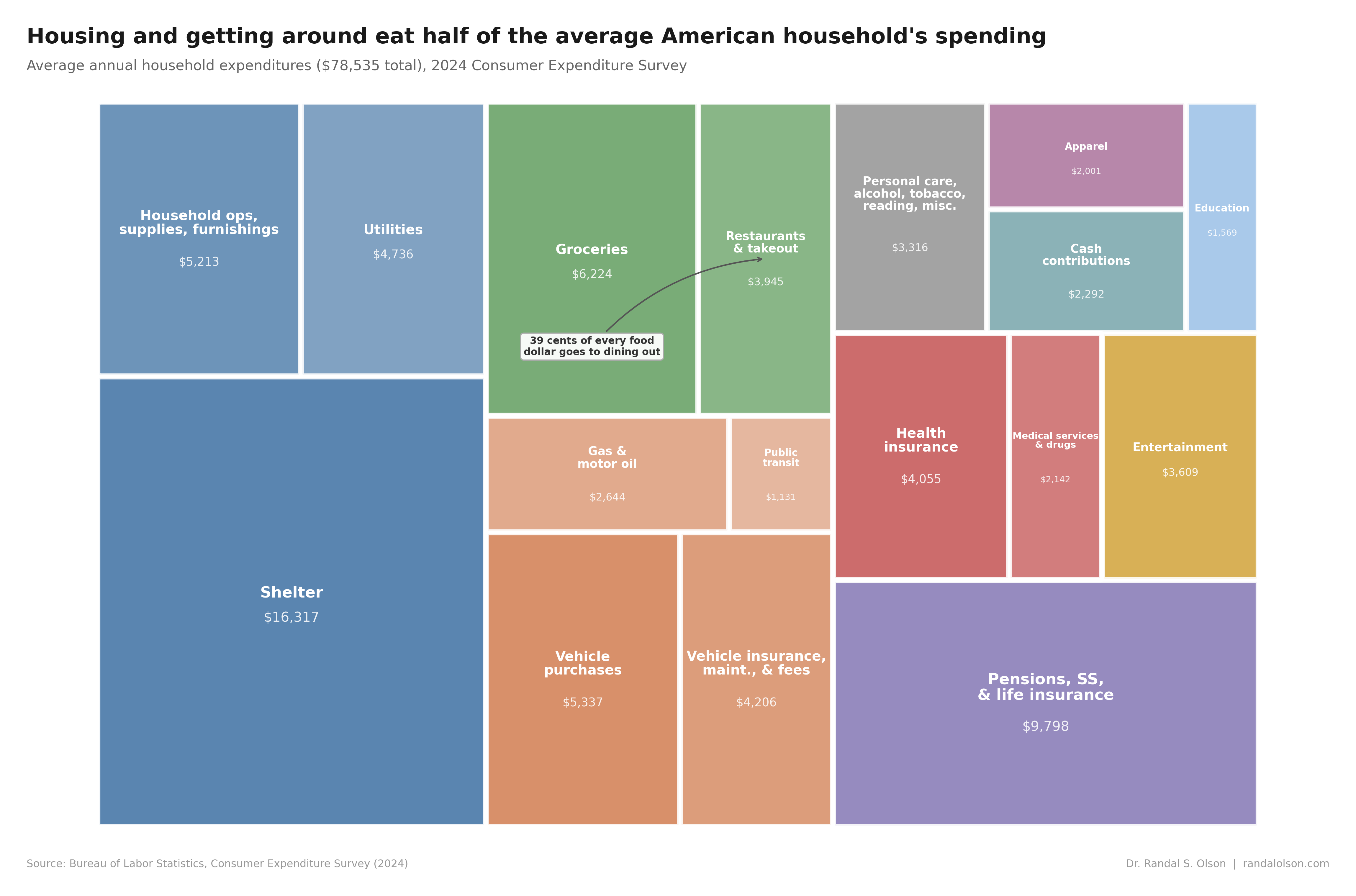
Housing and getting around eat half of the average American household's spending
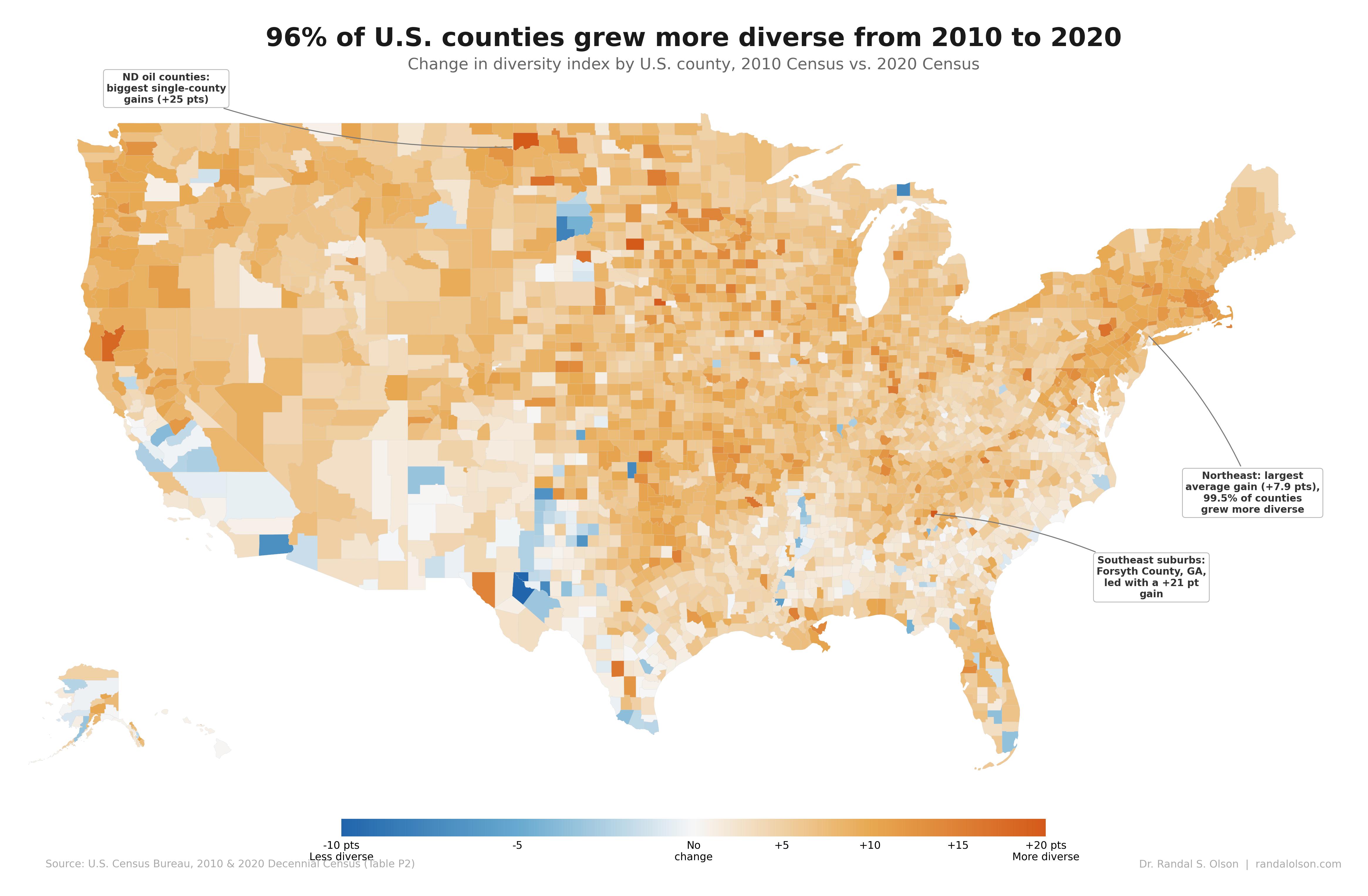
96% of U.S. counties grew more diverse from 2010 to 2020
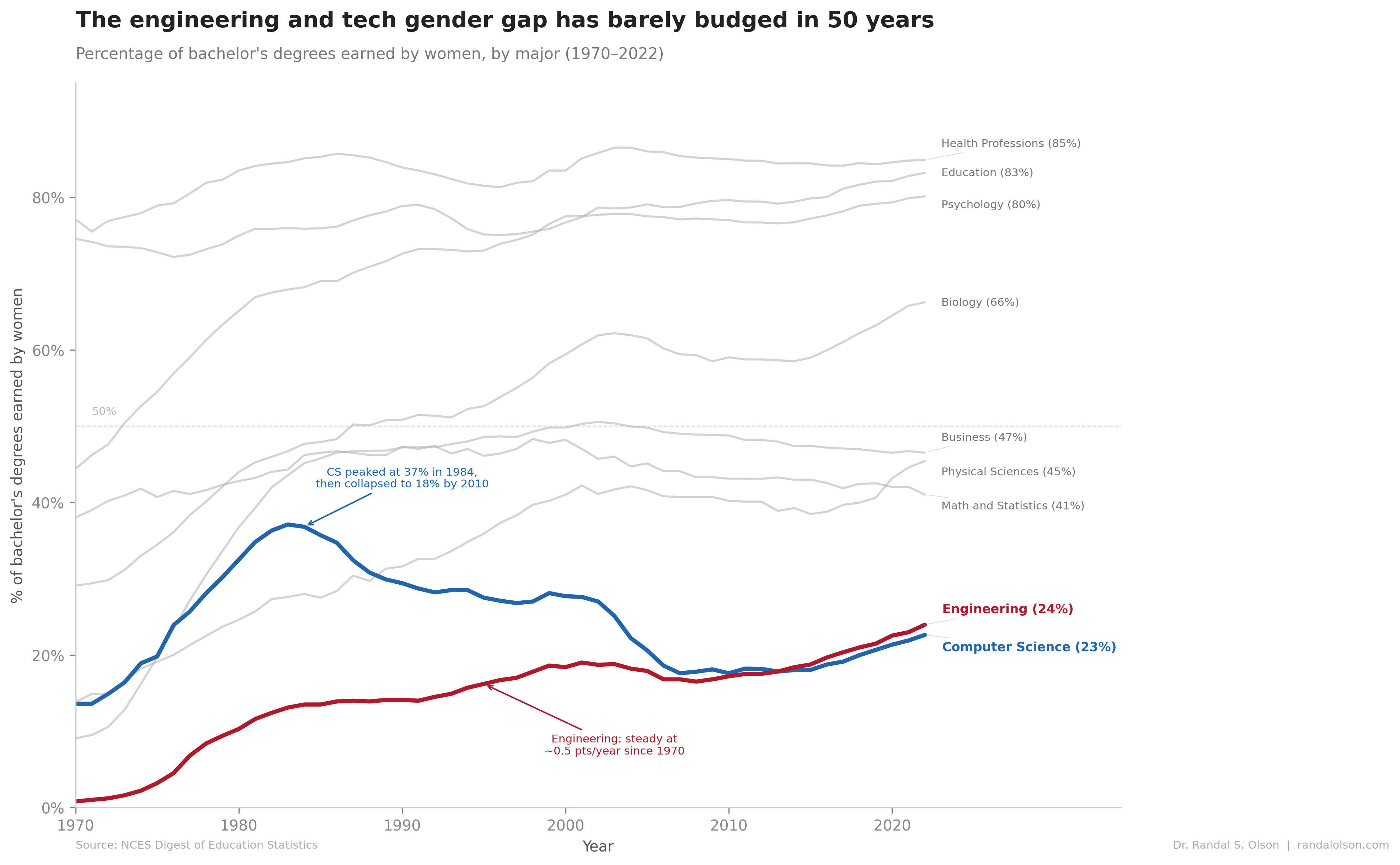
The engineering and tech gender gap has barely budged in 50 years
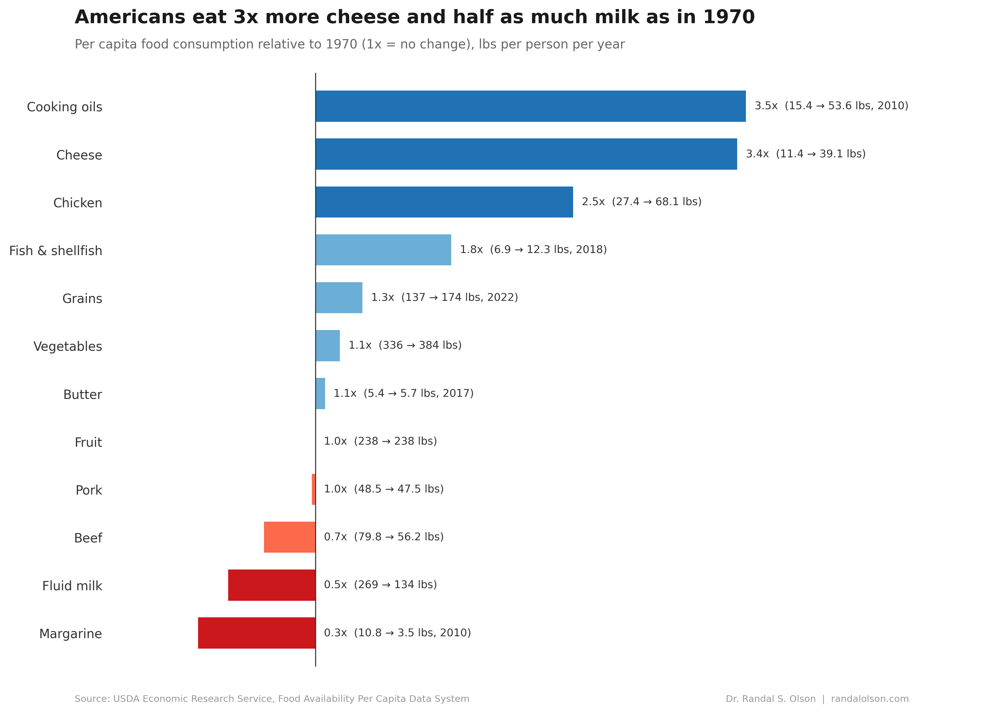
Americans eat 3x more cheese and half as much milk as they did in 1970
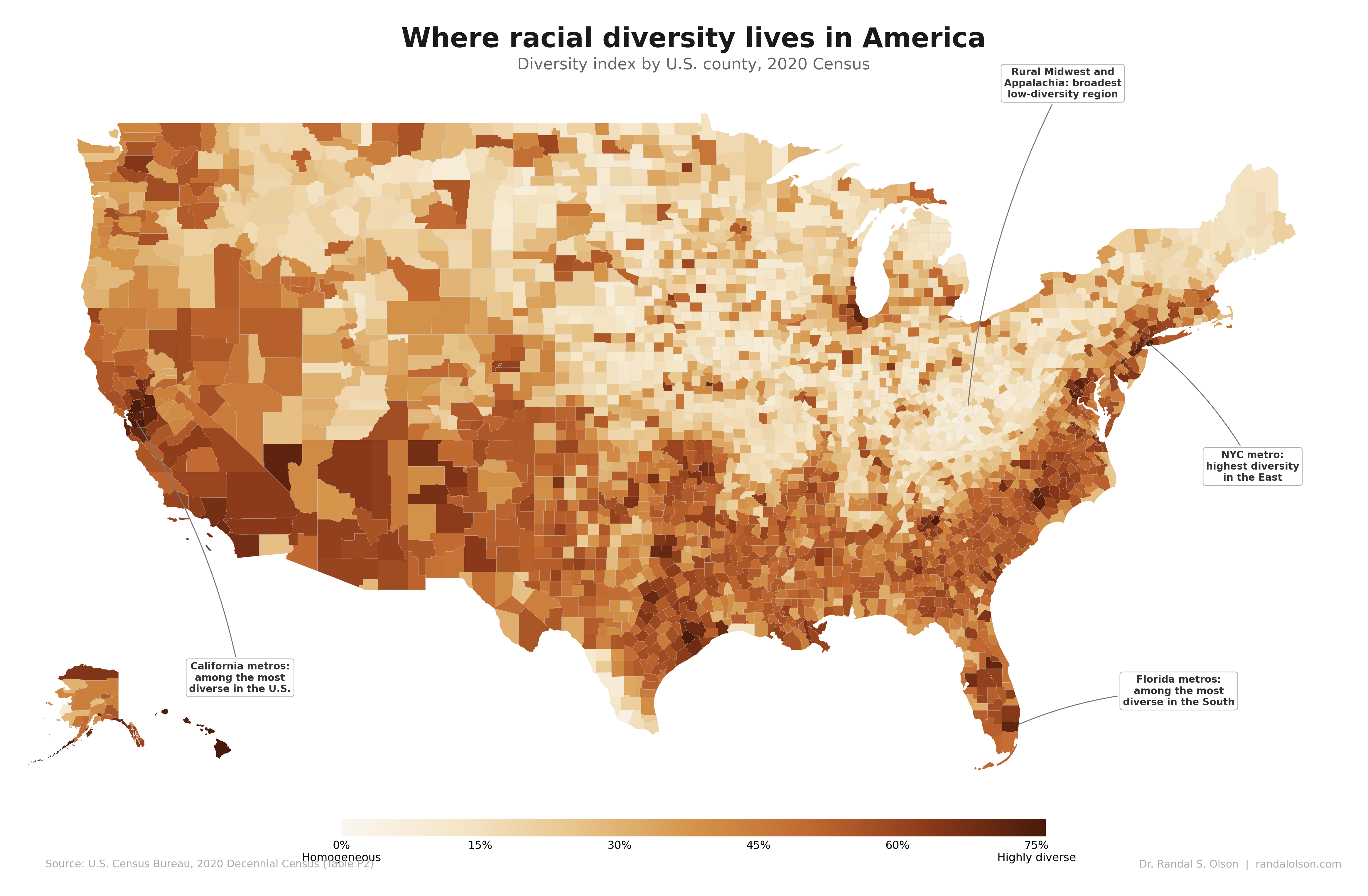
Where racial diversity lives in America, county by county
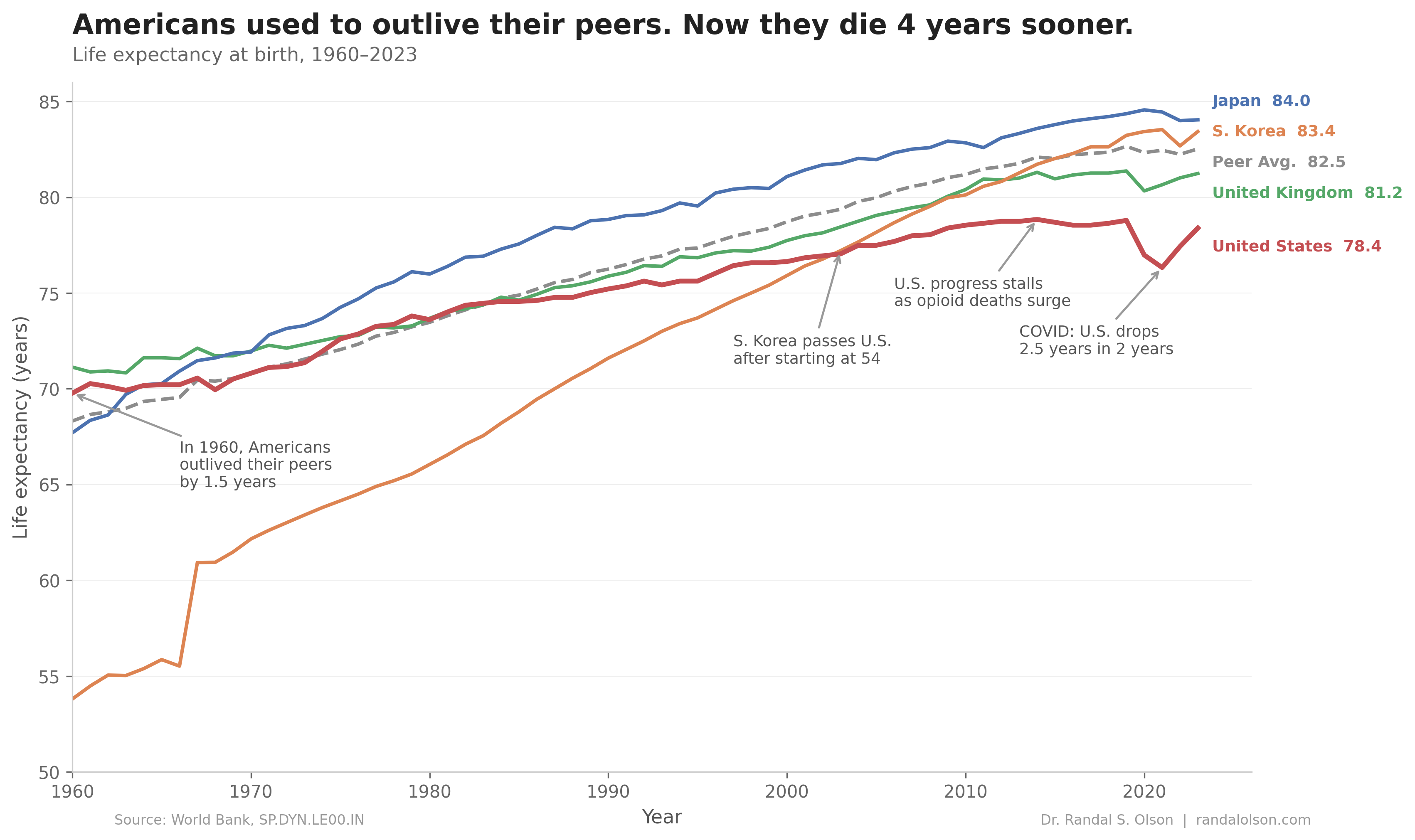
Americans used to outlive their peers. Now they die 4 years sooner.
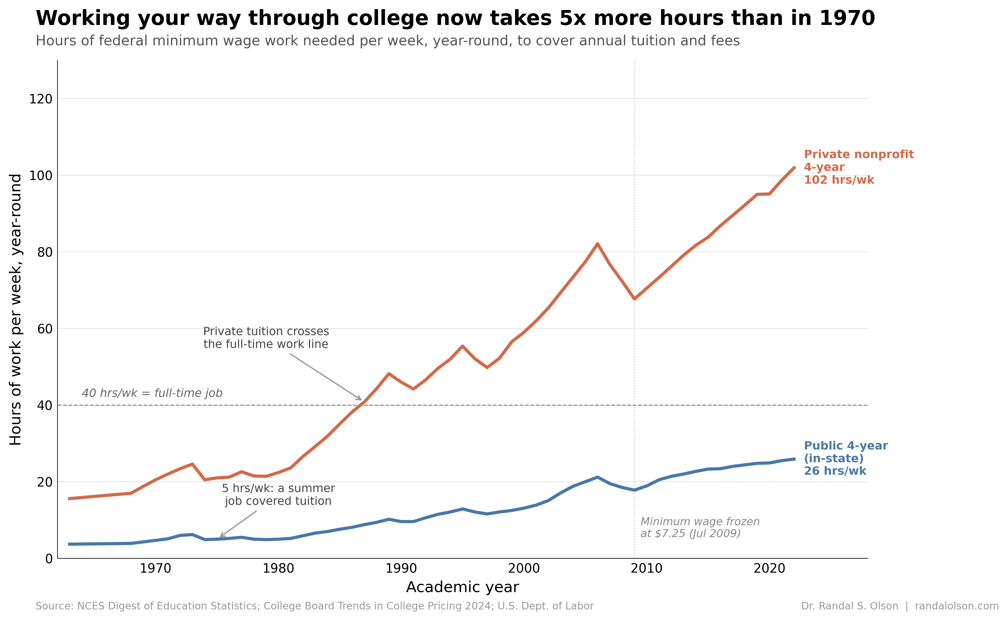
Working your way through college now takes 5x more hours than in 1970
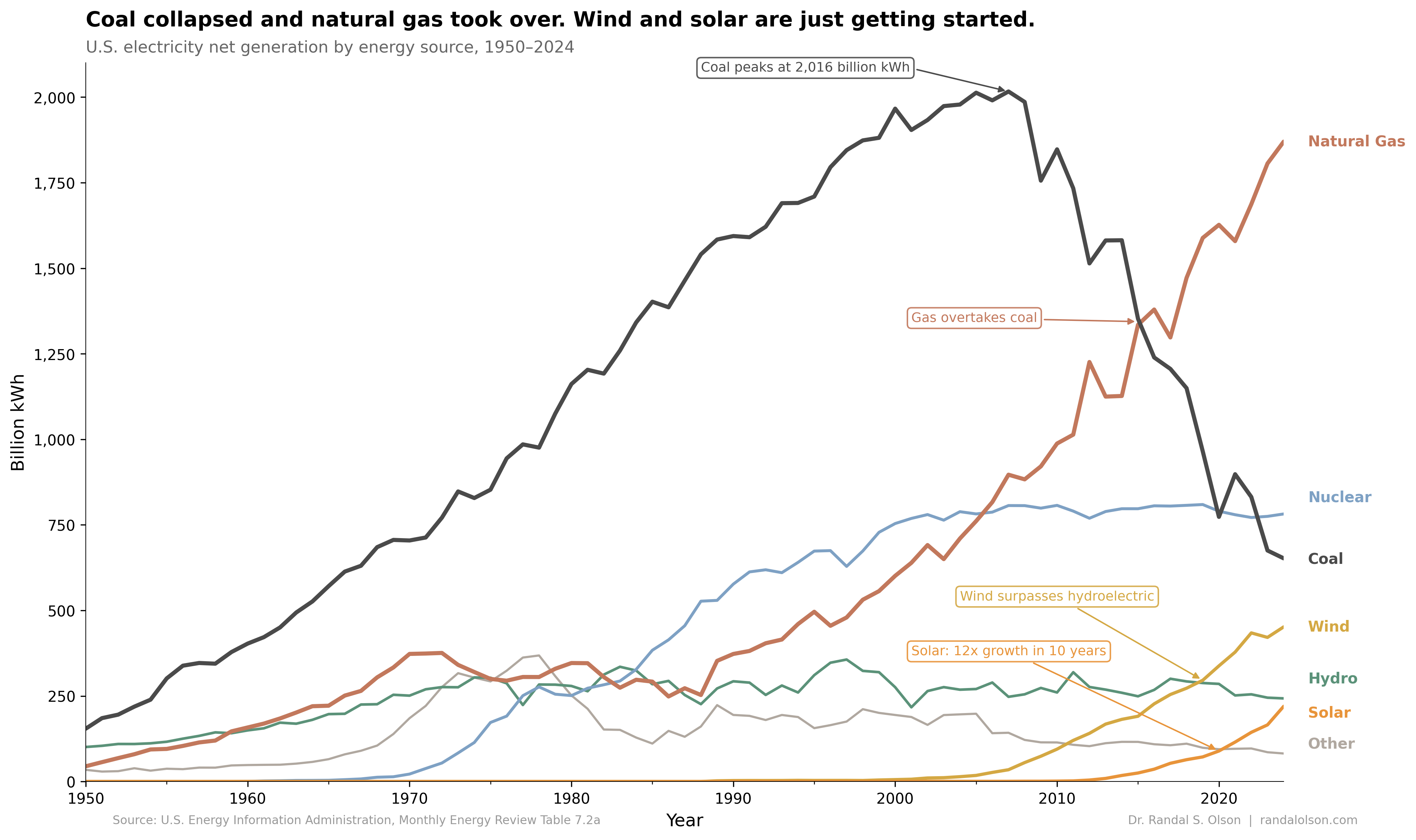
Coal collapsed and natural gas took over the U.S. power grid