The ebb and flow of movies redux
Six years ago, the NY Times published one of my favorite interactive graphics entitled, "The ebb and flow of movies." This brilliant graphic concisely visualized over two decades of box office sales with the now-popular streamgraph. The colors indicated how well each movie did -- from hit to flop -- and the height of the vertical area signified how "hot" each movie was the box office each week. As you scroll through the years, you'll see now-classics like Back to the Future and Jurassic Park pop up and fade away in the seemingly endless stream of time.
One of the most unfortunate parts of this graphic is that it's terribly outdated at this point: The latest movies listed were popular back when I was still a sophomore in undergrad. As such, this post will be the first in a series of articles documenting my attempts to revitalize and update "The ebb and flow of movies" to 2014 (and soon, 2015).
Visualizing 3 decades of box office sales
At this point, I've gathered the weekly box office sales of the top movies for the past 3 decades (1982-2014), which fits comfortably into a ~8 MB file. However, it's been surprisingly difficult to find visualization software that can visualize 3 decades of data into a streamgraph without crashing. I've had the best luck so far has been with the RAW engine, which I used to plot 5 years of box office sales (2009-2014) below.
Darker blue = more total sales for that movie
Lighter blue = less total sales
Vertical height indicates weekly sales
You can click on all of the images below for zoomed-in versions.
Obviously this graph isn't particularly useful for communicating information about specific movies, but it does show the seasonal ebb and flow of movie sales, which I look at in more detail below. Ultimately, we'll need an interactive version similar to the NY Times rather than this static graph. I'm open to suggestions for software.
In the meantime, I've visualized zoomed-in versions of the past few years of box office sales below. The left side of each label starts on its corresponding area. Sorry for the overlapping names in some cases; there are so many movies that I had to place all of them automatically.
2014
2013
2012
Seasonality of box office sales
Another phenomenon that the original "Ebb and flow" article pointed to was the seasonality of box office sales:
Summer blockbusters and holiday hits make up the bulk of box office revenue each year
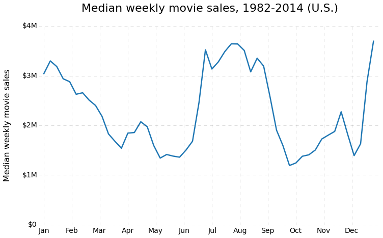
Streamgraphs make for a pretty presentation of sales, but the seasonal trends are better communicated with a line chart. Below, I calculated the median weekly movie sales for each week over the 1982-2014 period.
Sure enough, we see the clear mark of the blockbuster season from mid-June through August and the rush of families to the movie theater after Thanksgiving and Christmas. What's more surprising to me is the spike in mid-April. What's going on there?
That's all for now! Hopefully we can find the software to pull this revival off.

Dr. Randal S. Olson
AI Researcher & Builder · Co-Founder & CTO at Goodeye Labs
I turn ambitious AI ideas into business wins, bridging the gap between technical promise and real-world impact.


